Logo redesign is a common practice among brands seeking to stay relevant and appealing to consumers over time. This strategic move is driven by the evolving needs of brands at different stages of their development. An updated logo and tagline help brands to stand out in the market and attract an expanding consumer base. Brands aim to maintain the attention of loyal customers while also capturing the interest of new ones by presenting a fresh and innovative image. Some brands opt for dramatic changes to their visual identity, while others make subtle adjustments, aiming for a balance between a contemporary look and consistency. The process of logo redesign often involves a thorough name analysis, ensuring that the visual elements align with the brand’s identity and resonate effectively with the target audience.
In the following article, three interesting trends in logo redesign will be discussed, namely 3-dimensionality , simplification, and colors. Examples of logo redesign and how they impact brand equity will also be examined.
With rapid advances in digital technology, brands sometimes struggle to keep their logos appearing attractive on new media platforms. Whereas previously logos were often only applied to tangible or flat surfaces such as letterheads, billboards, product packaging, etc., logos now need to be used in a variety of digital and interactive mediums, causing many brands to redesign their logos into a more 3-D version. This three dimensionality or depth of field can help a brand build a modern, chic as well as high-end image. This unique character makes the brand distinguishable and memorable at the same time. With good execution, this approach should perform well in high-tech and internet sectors. However, brands still should take extra caution to keep such a change relevant to their target audience and overarching brand idea.
A startup brand might need a more detailed logo to differentiate itself in the market. But as the business grows in size and notoriety, so must its logo evolve. A brand with global recognition may choose to redesign its logo using a simpler presentation.
One way to simplify a logo is to remove or shorten the text. Big brands such as Pepsi, Shell, Nike and Starbucks used to have their brand name in the logo. But once they achieved a higher brand stature, they removed the brand names. Other brands opted for adopting acronyms instead of the full name in their redesigned logos.
The process of simplification however is a not necessarily easy. On one side it can make a logo more memorable, on the other it could also make it ordinary and unremarkable. Hence it becomes a challenge to design a logo that is simple yet distinguishable.
Different colors carry with them different evocations. A brand must be very prudent when deciding what colours to use, as these colours can have a strong impact on brand perceptions and ultimately the brand image. When taking a look at a number of logo redesign cases in 2011, approximately one third involved a change in colour. Moreover, among these cases the rainbow-colour scheme, orange, and purple were the preferred choice for brands undergoing redesigns.
Current trends seem to suggest that brands are becoming bolder and bolder in their usage of bright colours. Bright colours give brands a young and energetic feel. Rich, bright colours work well with children’s products, as well as in the entertainment and creative industries.
In addition to colours in logos appearing bolder, a growing number of brands are making use of the rainbow colour scheme for their logos. This color scheme reflects a brand’s openness to diversity and its flexibility, both of which are positive connotations in today’s business world. Yet, if the use of bright and various colours become too mainstream, the impact will be reduced.

Established in Greenwich, England,in 1937, the National Maritime Museum (NMM) is one of the biggest maritime museums in the world.
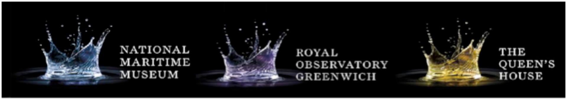
This year, NMM has launched anew logo series. The logo familyis a set of three water splashes in different colors: blue, purple and yellow, which is also 3-dimensional in appearance.
Old logo family
New logo family
According to the designer what makes this logo interesting is that“some see it as a crown, others see it as a ship, there’s even a star constellation amongst the droplets. We decided that it would be more reflective of the diverse offer of the group (NMM) to keep these elements subtle, so you see a splash first and foremost, then maybe something else at a second glance – like seeing shapes in clouds.”
The water splash series is relevant to the museum’s maritime theme, but it still performs well in its other applications. Its well-executed designis unique and sophisticated, and it allows for people’s imagination to make new creative connections.
MuchMusic is an established Canadian TV channel that used to be dedicated to music related programs and youth culture. However as it is gradually turned to reality-tv shows and movies, Much has adopted a new visual identity, and underwent a total make-over of its original logo.

MuchMusic logo evolution

The Martha Stewart Show logo
In the new logo a softer multi-color scheme was adopted and the famous disco ball was removed, a choice justified by the brand’s need to distance itself from its musical past.Although the logo redesign was necessary in order to reposition the brand, the move was met with criticism. On one hand, brand experts suggested that the new logois too similar tothe one ofthe Martha Stewart Show. On the other hand, fans of the channel have had a hard time digesting this drastic change becausethe previous logo had gained significant recognition during the past 15 years.
First introduced in France in 2004, Tassimo is a coffee machine brand developed by Kraft Foods Inc.
The previous logo adopted the color gold to suggest the high quality of the product. However,with its colorful flower-shaped logo and the playful round font, the new design is more in tune with the core brand values of freshness and youth. The rainbow colors represent the diversity of the drinks the machine can make, and the flower“petals” design is also featured on the individual coffee packets.
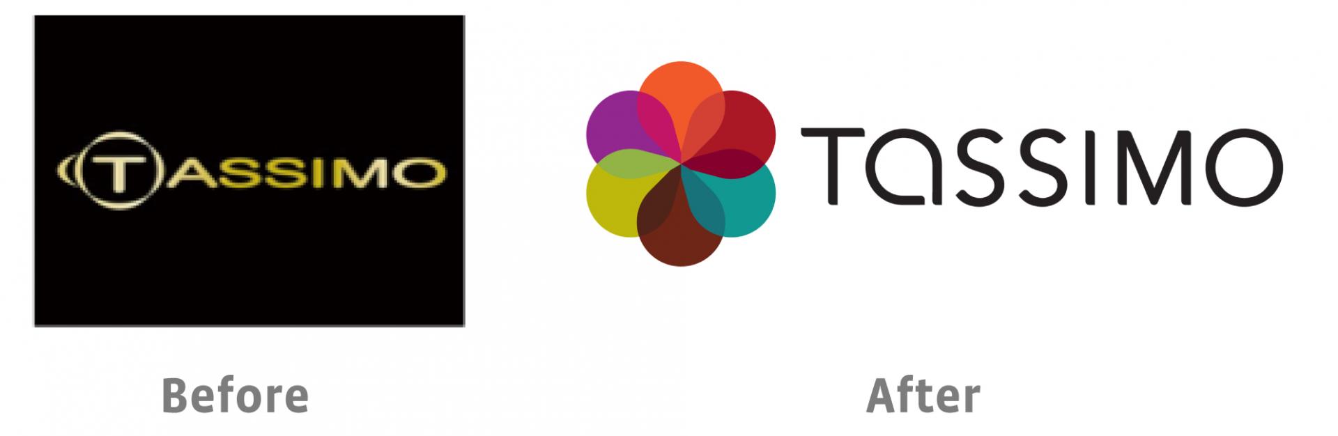
Tassimo logo evolution
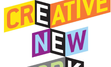
These threetrends in logo redesign have recently spilled into new logo design.An excellent example is the new logo of Creative Week New York (CWNY),which is both colorful and plays with depth. Most importantly the choice of shapes and font issimple, creative, and clean.
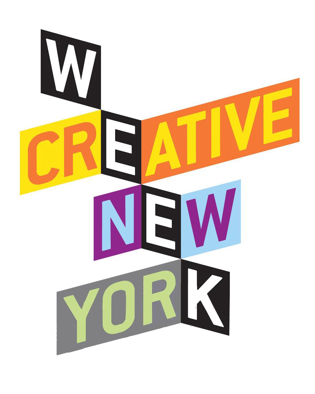
The designer describes the logo as the profile of New York City, “unlike other cities in the United States where outdoor advertising is tightly regulated, our adopted city thrives on the bold, visual cacophony it provides. The mad collision of billboards, street signs, speeding taxi tops, shop banners, sale signs, wild postings — the commercial lingua franca of Manhattan — covers every block here. It’s absolutely impossible to imagine New York without it.”
The effect is quite interesting, asno single word seems to stand out in the logo.For some the word “creative”is the first on to pop-up, while others immediately pick up the word“week”.Such is New York City: unpredictable and full of surprises.
The world of brands and logos is always on the move: new brands enter the market and try to create a buzz, while existing players aim to maintain their brand strength while enhancing esteem and knowledge. With advances in technologies and the ways in which logos are applied and used on a variety of platforms, the best practices for logo design and redesign are also impacted. Recently we noticed three trends: three dimensionality, simplification, and increased use of colours. However, who knows what the future holds- perhaps a swing back into shades of grey or complex patterns will emerge in the quest for differentiation. Trends and best practices in logo design are highly important for brands to ensure their brand images doesn’t fall behind in a rapidly changing market.
DOWNLOAD REPORT


To improve your experience, we use cookies to provide social media features, offer you content that targets your particular interests, and analyse the performance of our advertising campaigns. By clicking on “Accept” you consent to all cookies. You also have the option to click “Reject” to limit the use of certain types of cookies. Please be aware that rejecting cookies may affect your website browsing experience and limit the use of some personalised features.