

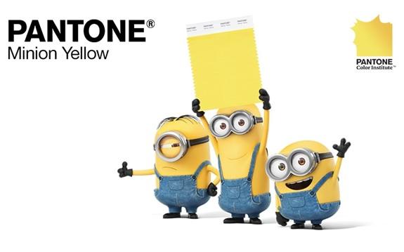
Bold, bright, vibrant, and ‘uplifting’ are the words used to describe Minion Yellow, the Pantone Color Institute’s latest addition to the Pantone Color Library. In a statement, the Institute’s executive director LeatriceEiseman describes Minion Yellow as “the colour of hope, joy and optimism.”While it seems a little excessive to attach such effusive descriptorsto a color, consistent research has shown that there is no gimmick in how colors can leave a lasting emotional impact. Uncover the significance of brand color and how they can evoke lasting emotions in the minds of consumers.
In fact, the Pantone Color Institute, a global authority on color standardization, releases reports annually on color trends and examines how different colors incite different emotional responses.Added in April of this year, Minion Yellow reflects what graphic and web designers have been describing as a movement towards brighter, boldercolors. Developed by the Institute, Illumination Entertainment, and Pharell Williams, this brand color was created to satisfy “the desire of the consumer to add more energizing color into their lives.”
Now, as more ‘vibrant’ and ‘energizing’ colors are coming into vogue across digital media, which ones are going to take the lead? Which colors will take the lead across the board and which ones will become associated with specific industries? Most importantly, how do brands use these colors on digital platforms to best communicate their own brand values?
Let’s take a look at the vibrant colors that we have loved seeing online over the past year, and how they have worked for different brands.
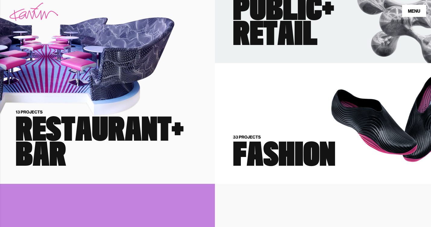
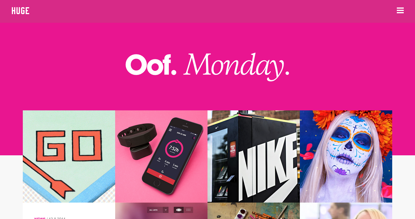
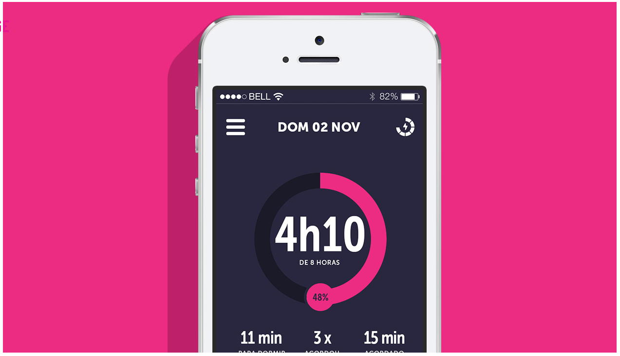
PINK (EC3A8C) – KARIM RASHID, HUGE INC., DO BEMMAQUINA
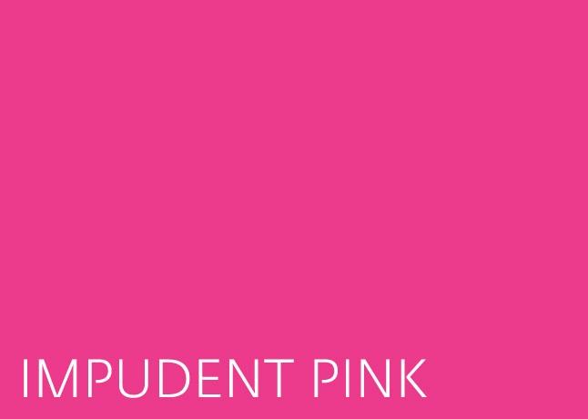
Explore the influential role of brand color, particularly the bold and distinctive pink hue, which has found its way into the logos and websites of various companies seeking an association with unconventional flair. This vibrant color often takes center stage, complemented by subtle black, white, and/or gray tones. Daring brands may venture into pairing it with other bright hues like blues, greens, and purples, as exemplified on design legend Karim Rashid’s website. While this approach suits brands known for audacious flair, it might be considered too bold for those catering to more conventional consumer needs or conservative clients. Delve into the strategic use of brand color and their impact on brand identity.
BRAZEN BLUE (1267E9) – GOOGLE, BLUEBITE, ADOBE’SBEHANCE
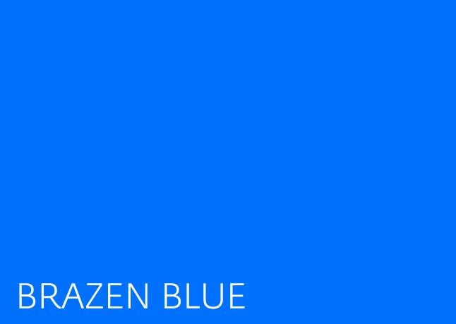
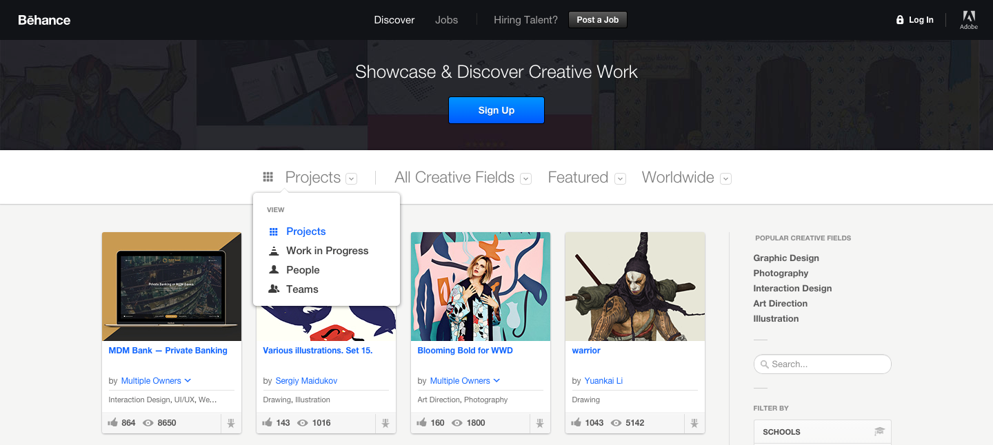
In print, this color would never come out quite right – it would be subdued and heavy. On the web, however, this color is vibrant and eye-catching, and still connotes the dependability that is typically associated with blues. Brazen Blue brings the electric creativity of the aforementioned pink without all the flamboyance, making it a choice for leading creative engineering brands like Google, Adobe’s Behance, and the rising startup, BlueBite. A word of caution – this blue is loud and can dominatea page. To maximize impact without compromising readability, designers often use this blue in small quantities against a neutral backdrop of black, white, and/or grays.


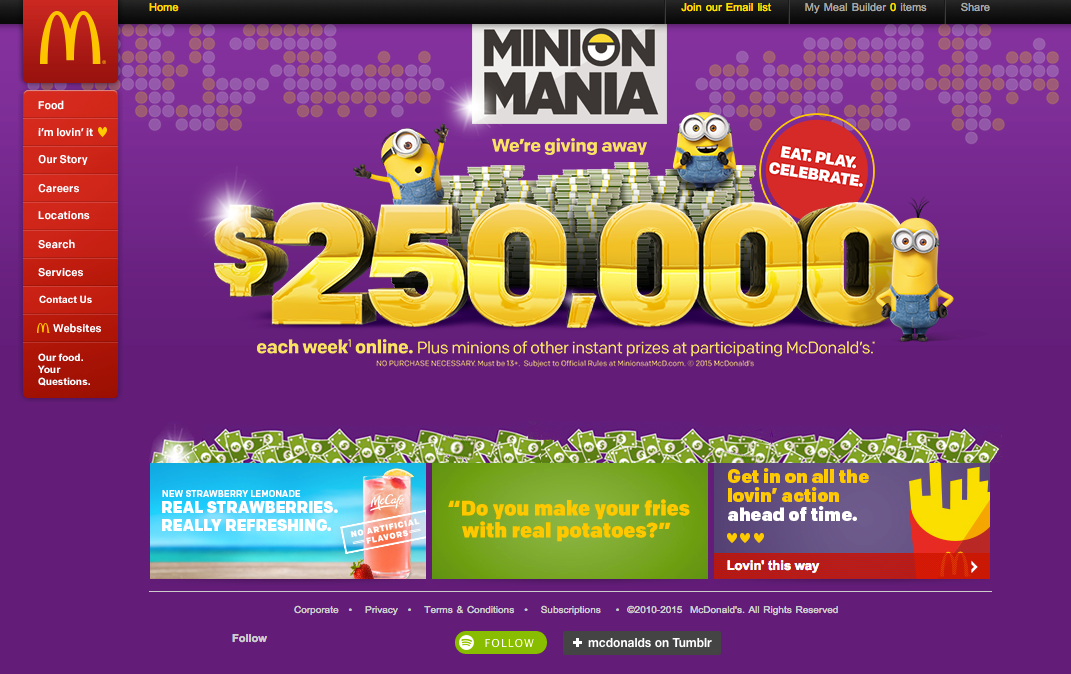
SOFT RED (D32232) – MCDONALD’S, GOOGLE

In McDonald’s massive rebranding efforts that began late last year, the company left behind its more abrasive red (FD0A2A) and opted for this softer red.The change is clearly for the best. The previous color is reminiscent of the ‘olden days’ of digital design, when brands did not stray past the original 16-color palettes installed in the first Apple and Microsoft personal computers. The softer red is more welcoming than the original, but does not sacrifice the energy and impact of the brightest red. An optimum choice for designers looking for a red in the digital age.

Softer, more pastel reds are being adopted by companies like Airbnb
SWIMMING CYAN (50B9BC)
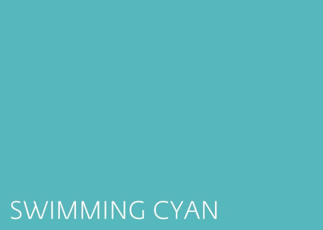
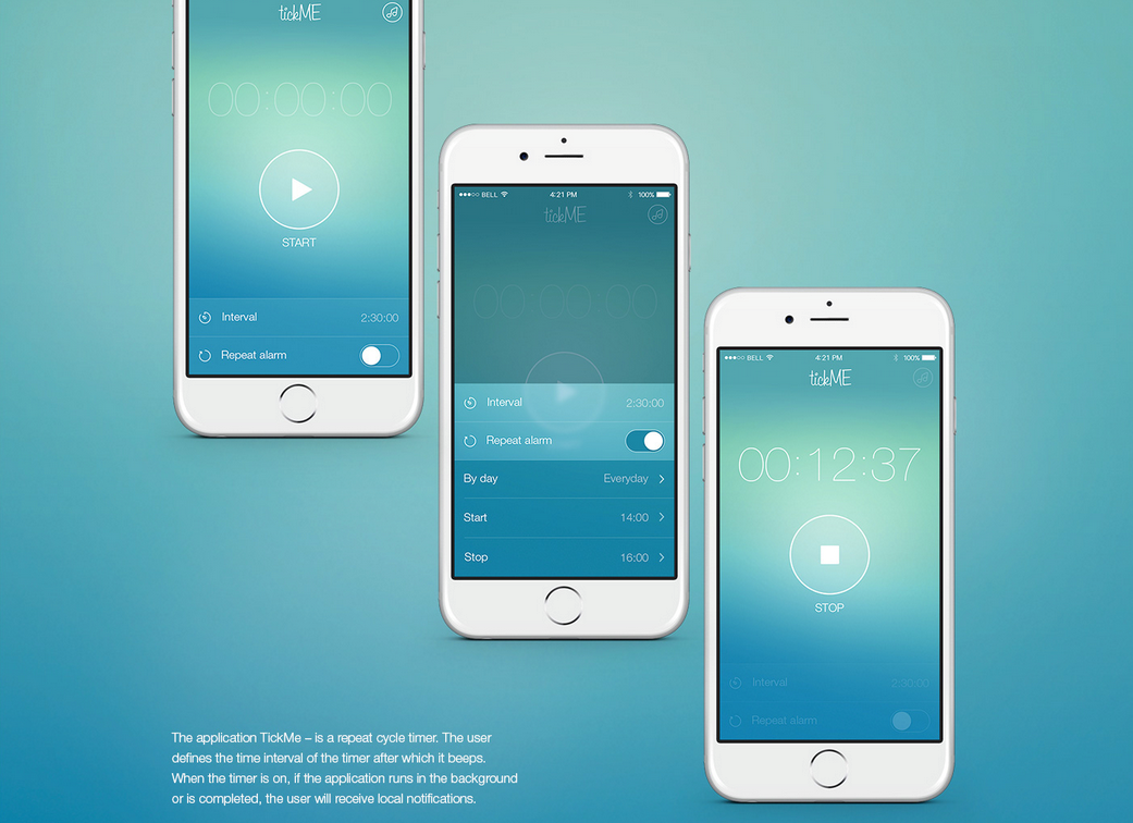
This color is seen all across the web, from website layouts toMcDonald’s latest stream of Instagram posts. This color in particular, a shade of cyan, is summery and light. With a red value of 80, a green value of 185 and a blue value of 188, this color has a considerable percentage of warm red to subdue its cool hue.Still, the color is cool enough to exude a degree of sophistication when set against dark grays or pale silver tones. This color is extremely adaptable, making it one of the more popular of the cyan swatches on the web.

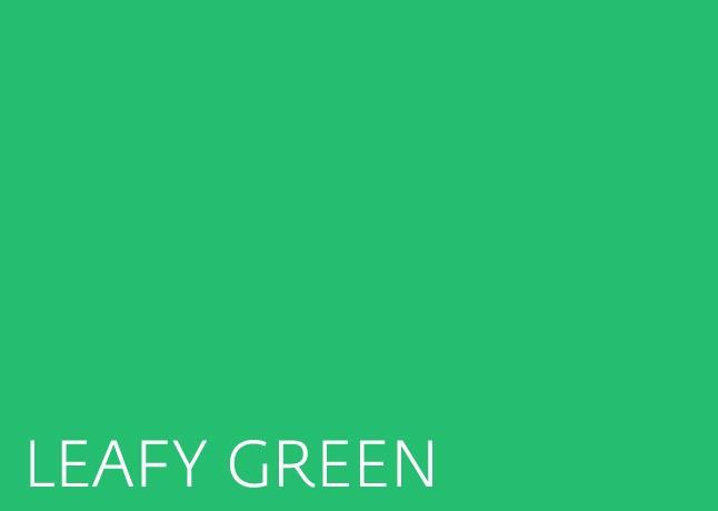
LEAFY GREEN (26BE70) – SPOTIFY
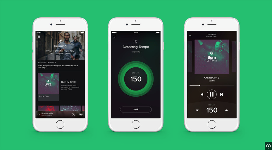
Leafy greens bring suggestions of the natural into digital world. This green in particular not only brings a bit of the natural, but also has an element of fun. It is bright and positive, but is a shade dark enough to ground the visuals on a web page. Seen in the recently updated Spotify logo, this green has a delightful whimsicality that energizes and excites. The color is most vivid (and most appealing) against a white background – a black background draws attention to the tinge of darkness in the hue and makes it appear dull.
BESPOKE BEIGE (EFEAEA) – AIGA

Delve into the world of brand colors, where pale beige emerges as a unique and vivid choice within the neutral palette. While it may not exude the same energizing qualities as bright pink or blue, this color combines the elegance of black and white with a mild chroma, introducing a playful twist. Favored by brands exploring lighthearted art and luxury, it even resonates with the aesthetics of the ‘hipster’ subculture. Witness its application on platforms like the AIGA’s Eye on Design blog, where it is paired with salmon-colored graphics and a flat, sans-serif curvilinear font, enhancing the overall sense of ‘playful elegance.’ Unlike conventional neutral colors, this pale beige offers a versatile blend of gentle appearance and artistic connotation, making it a preferred choice for contemporary web designers. Explore the nuanced impact of this brand color in shaping aesthetics and connotations.

A Labbrand Group Company © 2005-2024 Labbrand All rights reserved
沪ICP备17001253号-3To improve your experience, we use cookies to provide social media features, offer you content that targets your particular interests, and analyse the performance of our advertising campaigns. By clicking on “Accept” you consent to all cookies. You also have the option to click “Reject” to limit the use of certain types of cookies. Please be aware that rejecting cookies may affect your website browsing experience and limit the use of some personalised features.