Arla Baby & Me, a premium offering in the Chinese market, embarked on a strategic initiative to revitalize its brand and create synergy across its product lines, including Organic, BlueDawn, and Milex. To achieve this, Labbrand implemented an integrated brand design strategy, focusing on brand signatures, packaging, icons as well as Chinese naming for the trademark. By infusing authenticity and purpose into the brand’s visual language, Labbrand aimed to transform Arla Baby & Me’s strategic vision into distinctive and purposeful representations of the brand.
The challenge lies in rejuvenating the brand image of Arla Baby & Me product lines and evolving into a fresh consumer-facing look targeting each of their respective group of moms. To generate differentiation that separates Arla Baby & Me, BlueDawn and Milex from other dairy giants on the market while maintaining the brand legacy to further thrive in the context of China market. A future-proofed approach that facilitates long-term growth.
Labbrand truly brings to life the authenticity of Arla Baby & Me by introducing a holistic visual language and architecture with the IP characters. Implementing a cohesive and strategic brand design approach laid robust groundwork for Arla Baby & Me’s brand expansion, fostering a seamless and ongoing rejuvenation. As a result, Arla Baby & Me effectively distinguished itself as a premium brand in the competitive Chinese market, establishing harmonious synergy across its product lines and, most importantly, captivating the hearts of its intended consumers.
Trademark Chinese Naming
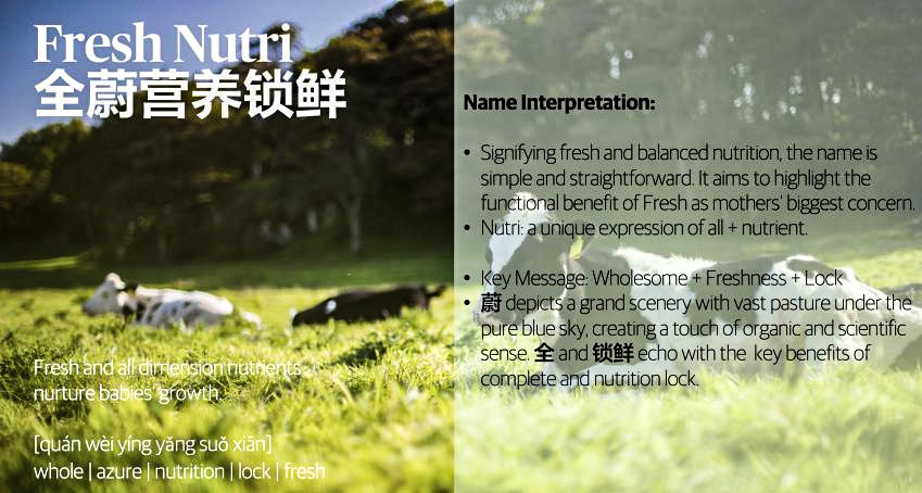
Leveraging the existing product essence, we created the Chinese name 全蔚营养锁鲜 for Arla Baby & Me Organic Trademark by highlighting the functional benefits, including pure, fresh and balanced nutrition, while depicting a grand scenery to evoke powerful associations that resonate well with target consumer.
Fresh and all dimension nutrients nurture baby’s growth. Nutri is a unique expression of all nutrients. Signifying fresh and balanced nutrition, the name is simple and straightforward. It aims to highlight the functional benefit of Fresh as mothers’ biggest concern.
蔚 depicts a grand scenery with vast pasture under the pure blue sky, creating a touch of organic and scientific sense. 全 and 锁鲜 echo with the key benefits of complete and nutrition lock.
Brand Signature Rejuvenation
Drawing from our identity design expertise, we create exceptional brand signatures that smoothly integrate multiple languages, and we define signature and typography systems that enable consistent brand communication. To establish the brand impression among Chinese consumer, the typography aesthetic and personality of a Chinese wordmark should match the Latin wordmark. Standing out as one entity helps build consistent brand recognition and strengthen brand heritage.
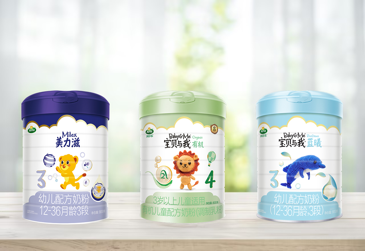
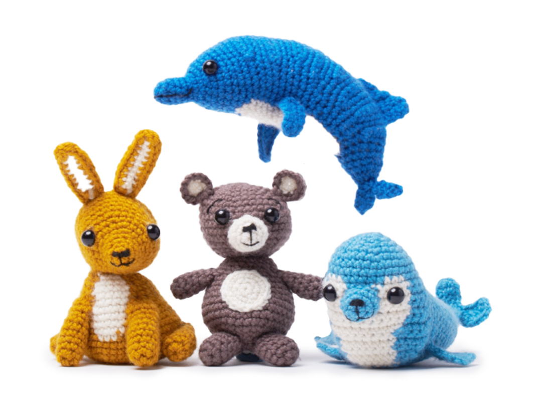
IP Character
Extending the knit animal universe to BlueDawn making a strong unity across the product lines enhancing the premium essence of Baby & Me brand. With the creation of truly ownable and differentiating IP-led brand assets, we brighten up the BlueDawn brand universe.
Meanwhile, surrounding elements for the IP characters in the packaging have been designed. Rich elements such as air balloons, bubbles, and water drops enhance the attractiveness and interactivity of the IP characters. There are different elements on the packaging at different stages, representing the cognition of children of different ages and shortening the distance between consumers and the brand. The trademark icon is also reflected.
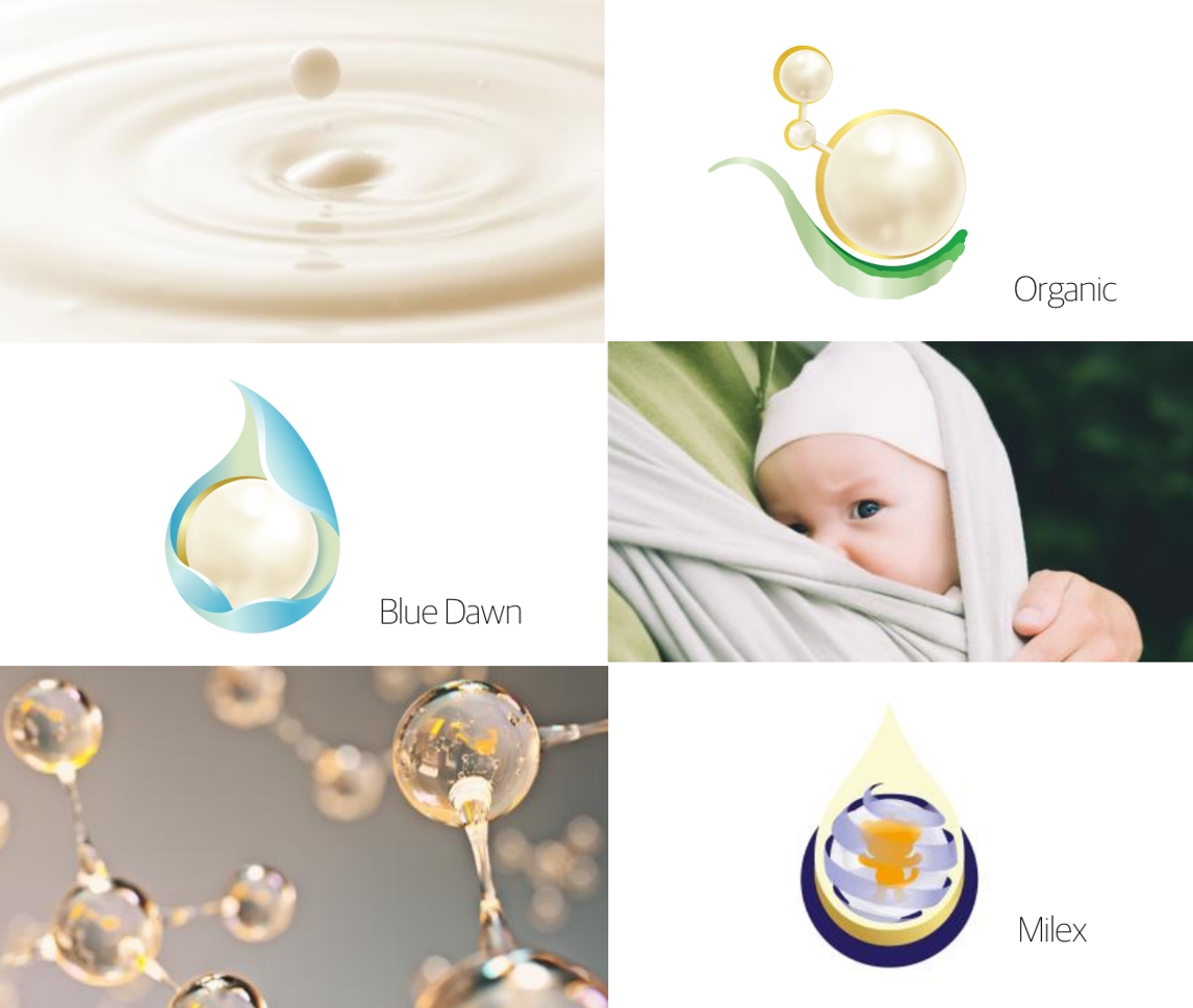
Trademark Icon
Leveraging a more integrated solution, we rejuvenate the trademark icons for each brand with soft and gentle expression to fully narrate the unique protection surrounding the product, which also communicates a more enhanced nutrition for baby’s harmonious growth.
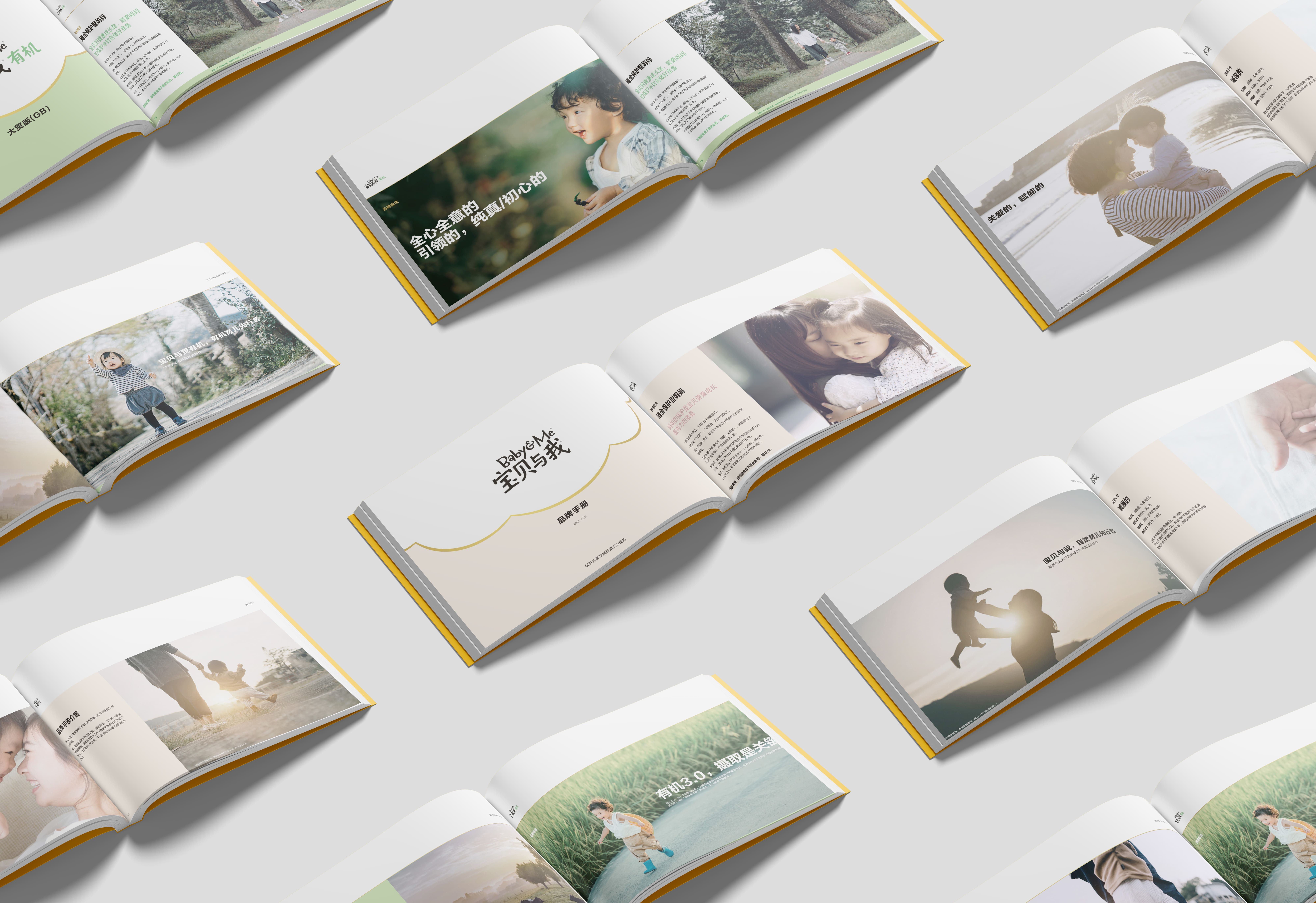
Brand Book
A holistic brand book was created to establish a consistent brand identity reflecting Baby & Me‘s premium positioning in China market, and to provide enhanced guidance and continuity across different applications and touchpoints.
With creative layout design, unique content and carefully selected images, the brand book was strategically implemented to reflect the brand universe and tell the story of each brand.
The result of strategic efforts to rejuvenate the brand image of Arla Baby & Me product lines has been nothing short of remarkable. Through a meticulous and holistic approach, Labbrand successfully crafted a fresh and engaging consumer-facing look tailored to the unique needs and preferences of each segment of moms in our target market. This differentiation strategy not only sets Arla Baby & Me, BlueDawn, and Milex apart from other dairy giants but also preserves the cherished legacy of the brand. In the dynamic and competitive landscape of the Chinese market, our forward-thinking approach has positioned Arla Baby & Me for long-term growth and resilience. This result marks a significant step toward future proofing the brand and ensuring its continued success.
We’re at the crossroads of brand portfolio premiumization, with the collaboration with Labbrand, we paved the road for the long-term growth of brands in the category matrix. With strong strategy capability and consumer insight, Labbrand imprinted distinguished brand value propositions and brought them alive through visual and verbal languages on multi-touchpoints. It’s been a thought-provoking journey.
Category Manager, Arla


To improve your experience, we use cookies to provide social media features, offer you content that targets your particular interests, and analyse the performance of our advertising campaigns. By clicking on “Accept” you consent to all cookies. You also have the option to click “Reject” to limit the use of certain types of cookies. Please be aware that rejecting cookies may affect your website browsing experience and limit the use of some personalised features.